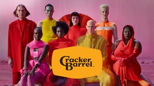
By now everyone around the globe has heard of the Cracker Barrel logo redesign. As with all modern logo updates, it has been made a lot simpler, a lot cleaner. Some people don't even see that the barrel is still in the logo, that's how clean it is. @shannanerginz still saw the barrel and explored the idea of a little outline to make it more visible in the new logo, which is quite nice.
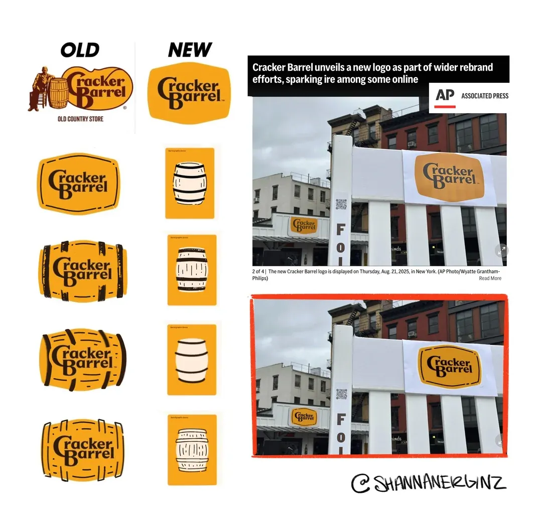
But why did this logo-update get so viral that Irish people are now asking what the big deal is?
Hi Americans,
— Eimhear Ó Dálaigh (@OEimhear) August 23, 2025
Can someone please help explain to the rest of us why this change of logo has caused such a furore?
Sincerely & gratefully yours,
A confused European (plus the rest of the world, probably) #CrackerBarrel #crackerbarrell pic.twitter.com/iIhcLsnYCx
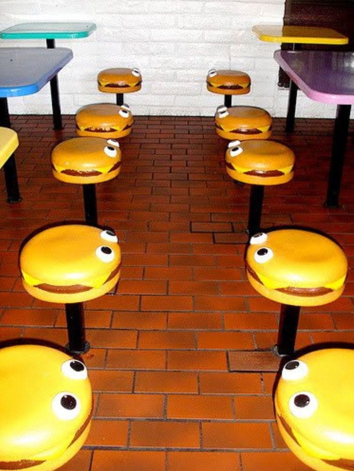
This isn't the first sleek update to a brand; we've seen everyone from McDonald's to Jaguar get a sleeker modern look. McDonald's have moved to a global redesign of their restaurants using recycled plastics, making every McDonald's look like a modern furniture catalogue, instead of the kid-centered silliness that kids in the 70s and 80s grew up with. While the world still eats at McDonald's, it's not nurturing a new generation of customers.
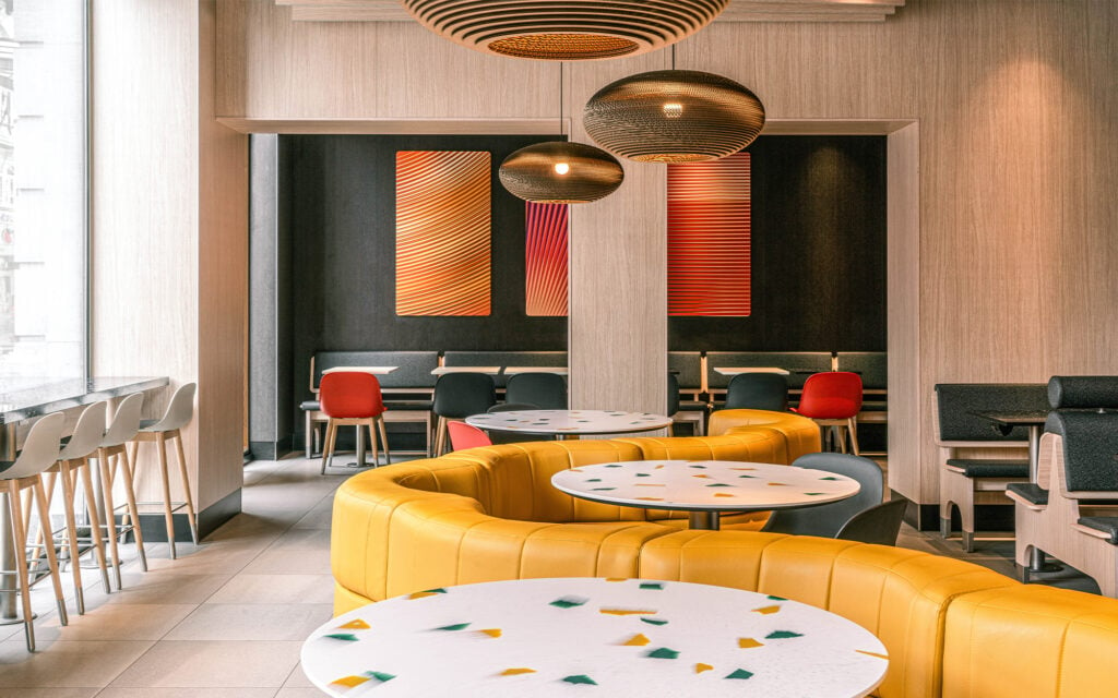
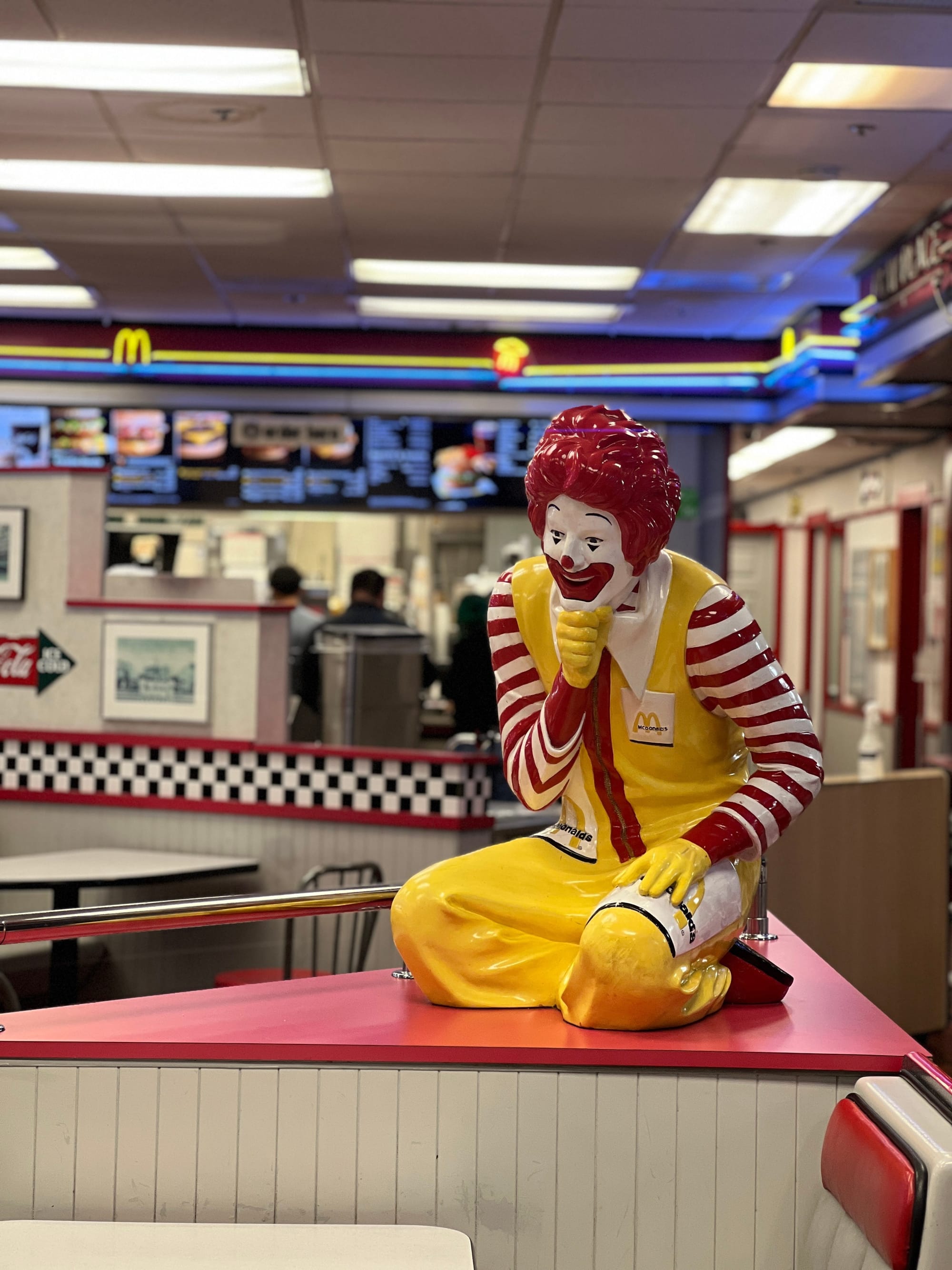
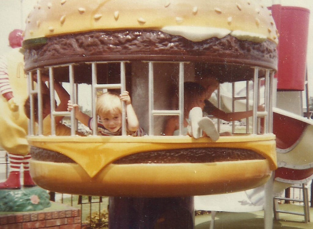
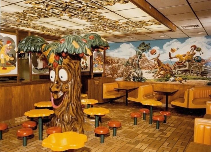
Everything is turning into a sea of same.
People in marketing and advertising don't make decisions in the dark; there had to be numbers involved when the CMO of cracker barrel made the call to "brighten" and modernize the restaurant locations, as well as change that old-school hand drawn logo.
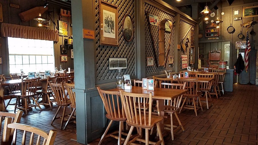
It's certainly cheaper to be less ornate, which is why we've watched everything become less "pretty," as everything has moved to simpler. This re-branding can be seen as the straw that broke the camel's rebranding back. In the US today, we have brand new box apartments, tall skinnys, airbnb's everywhere that have to announce the city they are in with a mural or neon wall stating it. From Nashville to Springfield (pick one), it'll all look exactly the same. The "Instagram ready" look, if you will.
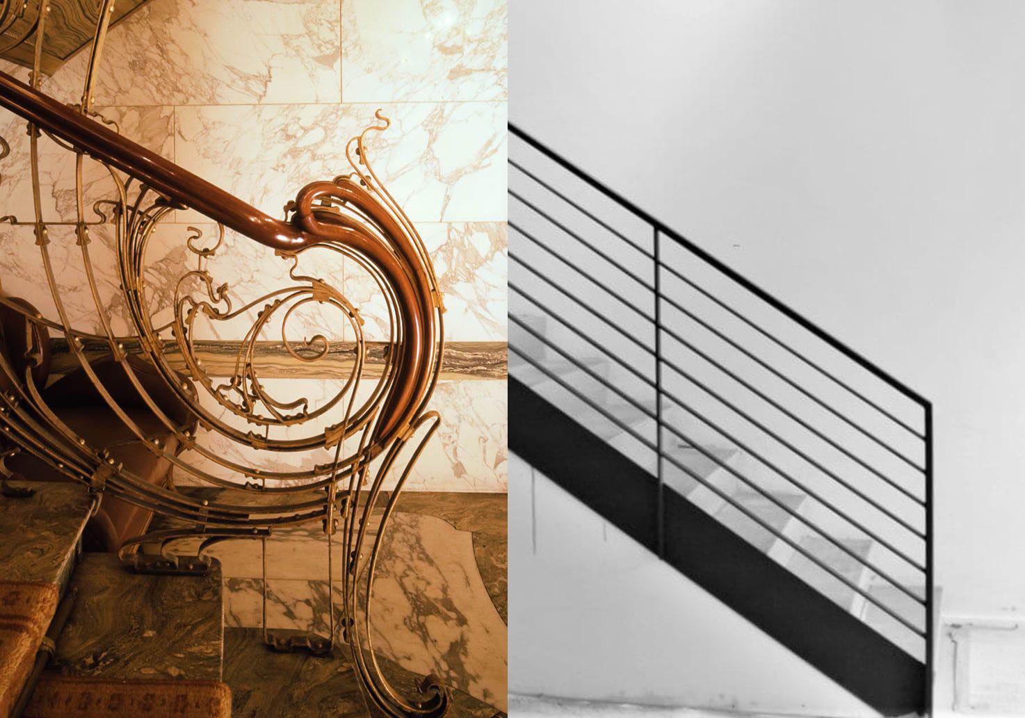
It's just "same". It's same same everywhere.
Why go anywhere on the planet if you're met with the same look, the same brands, the same mix of people? Do you remember when you were a toddler and got to fingerpaint? You'd get these tubs of non-toxic paint colors and paper and just have at it. Discovering that red and blue make purple was so exciting that I immediately went to mixing all of the colors to find out what they would become. Brown. It doesn't become black, it becomes a really shitty (pun intended) brown.
Like JOANN's, Cracker Barrels have served as a third space, based on the original idea of country stores where families can play checkers, shoot the shit, and eat a good meal. And like JOANN's people have a theory that this is an actual plan to get rid of the Cracker Barrel brand by running it into the ground and then selling off the brand's new generic assets to the highest bidder.
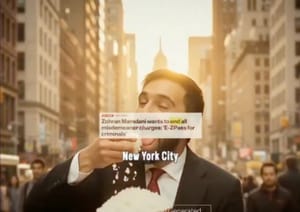
Gen Z and alpha who grew up on the internet long for something real, and as cheesy as cracker barrels are, they do mimic the old country store in a way that is nostalgic. Even when situated in places like Brooklyn, New York. This generation in the United States are choosing trade schools over college, they're sewing, knitting, canning and even making their own bullets. This generation was forced to online school during covid, and long for tactile skills as a result. They only look at AI videos when those videos ask them to come back to the 80s.
This video is nothing like my eighties, but we did have POTS (plain old telephones), and I used to call the ones in the subway station on weekend nights to see who answered, and ask where the party was. Sometimes, I would be the one sitting next to the same bank of POTS, ready to answer if anyone rang, to relay party information.
Cracker Barrel suffered during covid as well, when you can't go out to eat without vaccine cards or whatever the state demanded, people tend not to. In this post-covid hangover dip, Cracker Barrel thought a rebrand would help. It could have, if it had been done right.
Buc-ees, the American nirvana of gas stations has updates that follows the current trends without losing its brand soul. The kings of "fresh brisket on the board" have Keto friendly food alternatives right next to those carb loaded brisket sandwiches. Sugar free meat jerky, next to the teriyaki crazy flavors. If anything should have been done for cracker barrel, introducing Country Keto plates would have generated a lot of new interest. Country style collard greens and buttered chicken are still really tasty without the carbs, you know. America is on a health kick right now, with fast food chains switching away from seed oils and RFK junior is leading the health charge. Cracker Barrel didn't get that memo.
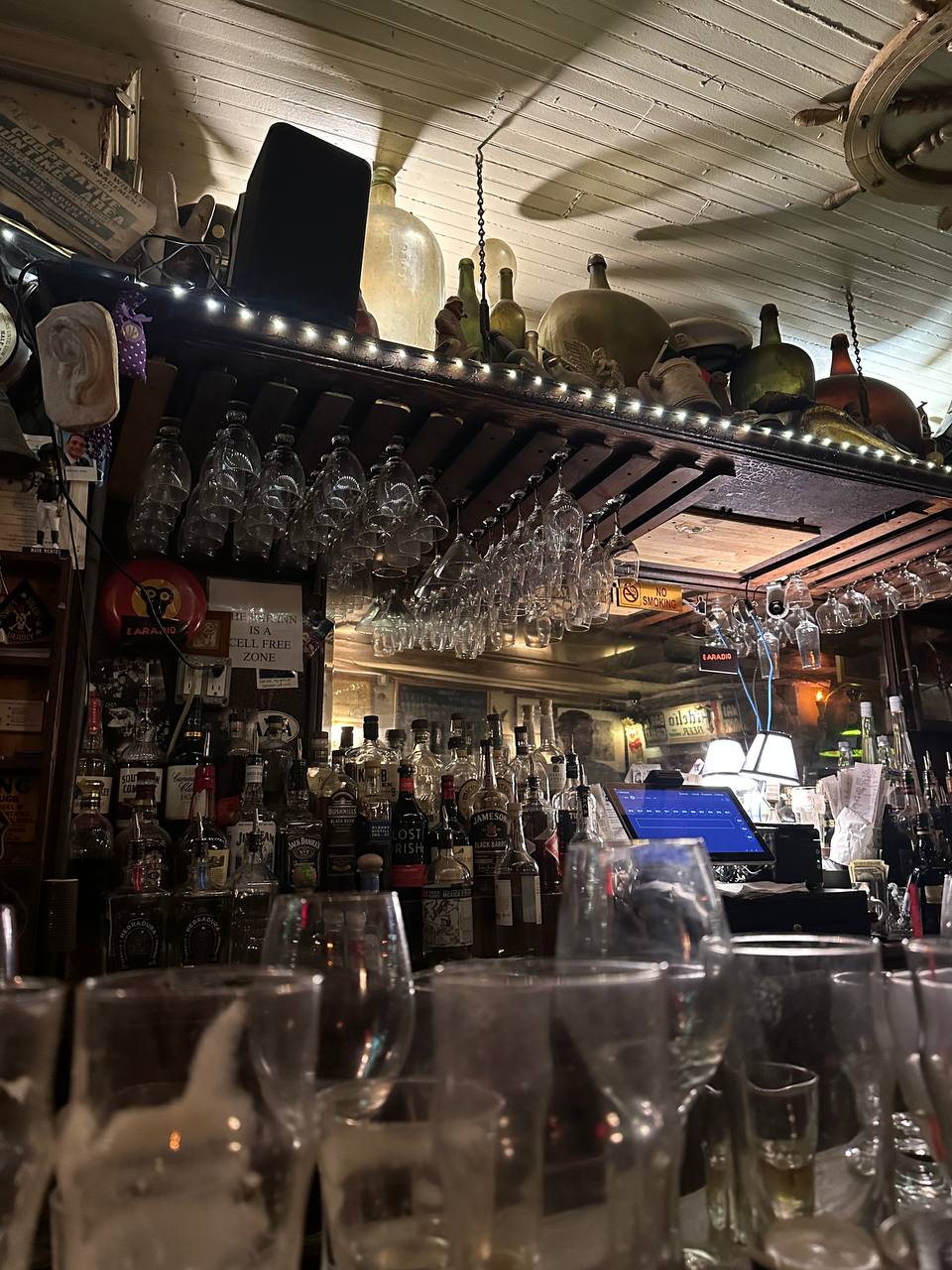
Cracker Barrel didn't just change the logo when they made it so simple, they stripped the soul out of the brand by stripping the history from it. Even if that isn't Uncle Herschel sitting next to the barrel, the logo told a story of a simpler time. Streamlining that into a simpler logo misses out on what made it charming, it was charming because it looked handmade, like one could imagine the rocking chairs at Cracker Barrel were.
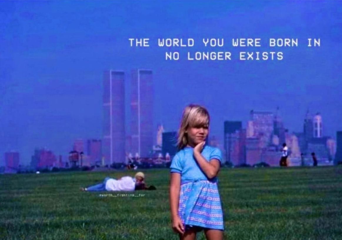
Consistency is key in keeping a brand alive, but brands have lost that they are a representation of a time and a place that probably doesn't exist anymore. They have thrown nostalgia out, in order to compete with the new slop on the market.
A new brand can begin with a sleek set of pastel colors, and eventually work its way up to becoming synonymous with such things, but an old brand can not. Design heritage is a real thing, but it's not just that - it's what people remember about the old that drives a brand. And sometimes, it's what the kids on TikTok thought the olden days were like that keeps a brand alive.
